Mexico Platinum SBS Card Application Redesign
Project Overview
Client: Internal (American Express Mexico)
My Role: Senior Product Designer, Project Design Manager
Team: Partner Team (Mexico), Project Manager, Product Owner, Development Engineers, Accessibility SME, User Research SME
Duration: 4-5 months
American Express aimed to redesign its Mexico Small Business Supplemental (SBS) Card Application. The goal was to streamline a complex, confusing process that was negatively impacting completion rates, customer satisfaction, and revenue.
The Challenge
Business owners applying for supplemental cards in Mexico faced:
Long, cumbersome application forms
Confusing flows and unclear next steps
Frequent "pended" applications (incomplete and unresolved)
These issues led to:
High call volume to customer service
Missed approvals and lost revenue
Increased internal workload
We also had a broader strategic goal: build a reusable design foundation for other card workstreams in Mexico.
Discovery & Research
After creating high-fidelity mocks we held an internal heuristic audit of the current user experience, identifying friction points and bottlenecks. Then, we used Mural to:
Collaborate and whiteboard ideas
Build roadmaps and align stakeholders
Share early sketches and flows
With the research team, I co-coordinated usability testing with real small business owners in Mexico, using a Figma prototype. These sessions provided rich feedback on comprehension, ease of use, and expectations.
Flow User Experience Chart (below) I created in Mural with partnership of the Product Owner.
SBS Company Application Fields (provided by the Project Manager)
SBS Company Go2 Journey
User Persona & Journey Map
I created the below persona and Journey Map (one of several) to address the needs of the Mexico Small Business customer. With the assistance of the Mexico Partner team, I interviewed select customers to understand their use of the legacy application, their goals, and pain points. I used the collected data to create several persona cards and journey maps for each. This was used in the not only the design planning, but also to better understand the application flow.
Design Process
I led the end-to-end design process in Figma, collaborating closely with the PM and Product Owner to:
Simplify and structure the application flow
Create wireframes and high-fidelity mockups
Develop a clickable prototype for user testing
Align cross-functional teams in weekly design reviews
Key improvements:
Reduced steps in the application process
Real-time document upload and status replies
Streamlined logic for Joint Obligors, Beneficial Owners, and Legal Representatives
Wireframes (first iteration - below)
Heuristic Analysis
The internal team used Mural for its review, team members included the Design Director, Product Designers, UX Researchers, Product Partners and the Accessibility subject matter expert (SME). We followed an internal design method D.I.R.E.C.T. (Delightful. Inclusive. Relevant. Extensible. Credible. Transparent.).
Delightful - Create emotional connections that resonate and increase conversion.
Inclusive - Embrace unique perspective, backgrounds, experiences.
Relevant - Targeted content supports technical, legal and persona requirements.
Extensible - Focus on spent solving journey / market problems less time on common ones.
Credible - No mattor big or small, any errors and issues can erode perception - it takes 3 good experiences = 1 bad.
Transparent - Promote user confidence by being communicative and concise throughout the journey.
Company-wide email kudos sent by the Vice President of Product Development Market Foundation.
Accessibility Focus
Accessibility was a major focus throughout the project. I collaborated closely with an Accessibility Subject Matter Expert (SME) to ensure the redesigned experience met high standards for inclusivity.
This included:
Multiple accessibility reviews during design sprints
Testing for keyboard navigation, screen reader compatibility, semantic code from the developers, and color contrast
Revising components and flows to meet WCAG guidelines
Ensuring form fields, buttons, and document upload features were usable by all customers, including those with disabilities
These improvements helped American Express align with global accessibility standards and ensured a smoother, more respectful experience for all users in the Mexico market.
Example (below): the H3 Title must be read by a screen-reader on the Edit (Editar) button, allowing the user to know what section they are editing. We made sure to follow the General Law for the Inclusion of People with Disabilities (LGIPD) the national law in Mexico for website accessibility guidelines.
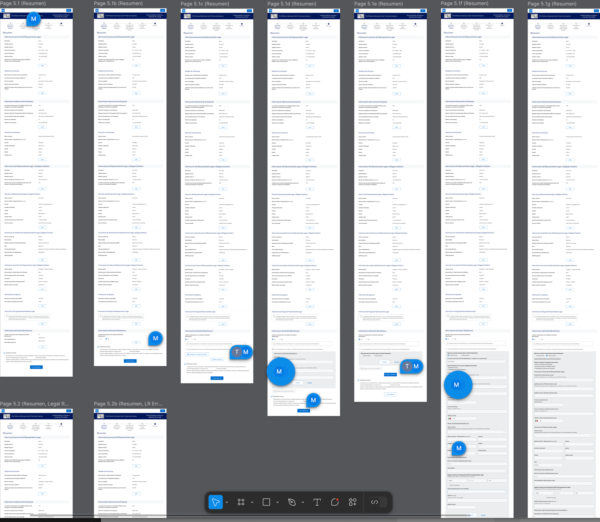
Final Mocks
Figma board (below) - this is just the Review (Resumen) page and all of its variants. Displaying comments between myself and the Project Manager for collaboration and alignment. Variants based on earlier selections and if the user wants to edit any of the Legal Representatives, Business Owners, or Joint Obligors.

The Outcome
The redesigned experience launched successfully, contributing to major improvements across SBS and Consumer card programs in Mexico:
Migrated acquisition volume across 20 Channels for Consumer and SBS (Small Business Supplementals)
Launched 14 card products including Co-Brands
Real-time document upload and application status (Declined, Canceled, Pended)
Fraud detection improved via NAAT and Go2 Improved
Digital Centurion Capture Option Developed
New Integration between SBS Individual and One Force Established
Application Documents can be requested systematically as part of Go2 Ul Features
A new SBS Line of Business (LOB) was built from the ground up
DNB Bureau Integration and bureau calls for SBS
|| The below sent in a company wide email by the VP Product Development Market Foundation, Enterprise Acquisition Products & Platforms
Special Thanks: (A long list of non-design contributors, including:) UX/UI Designer: Travis Richardson
Mexico Market Migration Met Goals
Reflections
This project was rewarding but uniquely challenging due to cultural and regulatory nuances in Mexico. Working with both U.S. and Mexico teams required thoughtful negotiation and guidance, backed by research and design best practices.
There were many iterations—sometimes daily—but it led to deep cross-functional alignment and a scalable design system that will influence other international journeys and products.
🖱️ VIew the application on the live website: Tarjetas de negocios - The Business Platinum Card® American Express®